Case study:
UX writing for Rosetta Stone mobile apps
Please note: These apps are no longer available in the Apple App Store or the Google Play Store.
I was part of a small cross-functional team that launched multiple mobile iOS and Android apps for language learners. My focus was on all user-facing content from app store marketing copy to in-app UI strings and error messages.
What was the problem?
Language learning software pioneer Rosetta Stone had a tight timeframe to launch a series of new mobile apps for international travelers. The apps were a cross between the full online course and a digital phrasebook.
Users needed to find the app, decide to use it, and quickly understand how to use it. At the same time, Rosetta Stone needed the UI content to be on-brand, and localized into multiple languages.
Who was involved?
PROJECT TEAM
Multiple software engineers
Product manager
UX designer
John Collins (content designer)
Curriculum designers
How was the problem solved?
Due to the tight deadlines for these apps, I was very hands-on.
I worked closely with the UX designer and software engineers to understand user flows and advocated for UX content. In one case, I was driver for designing a series of screens to help users understand interactions.
I partnered with curriculum designers to make sure that UI strings reflected the proper pedagogy.
I teamed up with marketing folks to get consensus on app store descriptions.
I acted as a localization manager, making sure that the app store content and UI strings was translated faithfully and in a timely manner.
I worked directly in the software codebase to write UI strings, reviewing them in tools like Simulator, refining the UI strings, and even making a few visual UI styling changes that were in UI specs but that software engineers had not addressed.
What was the outcome of this project?
We shipped 17 localized apps in 15 months.
The apps were among the top results in app store searches.
Initial localized walkthrough screen
-

Instructions (English interface)
-
Instructions (Portuguese interface)
-
Instructions (Japanese interface)
Entire walkthrough sequence
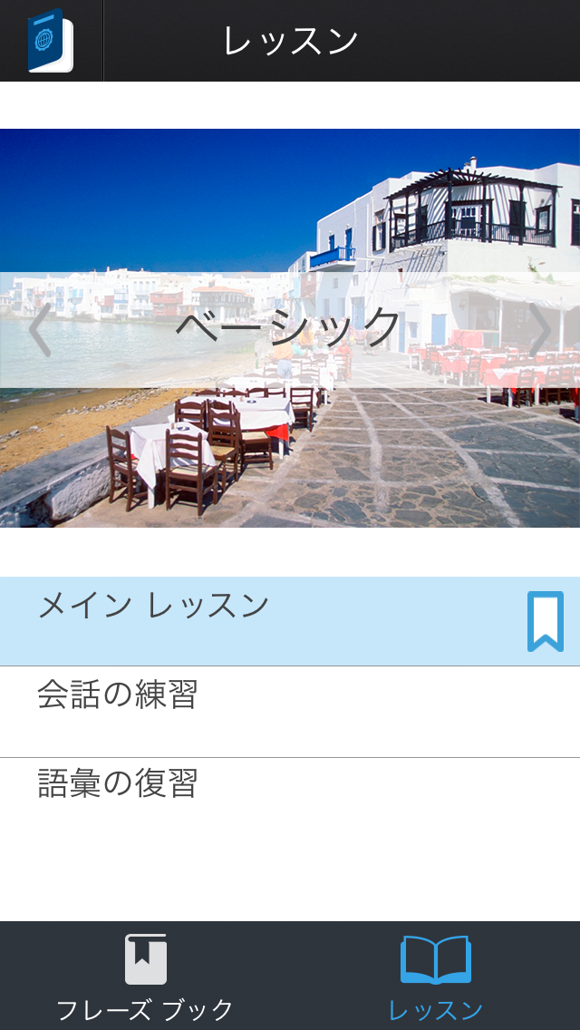
Localized lesson landing screen
-

Lesson landing screen (English interface)
-
Lesson landing screen (Portuguese interface)
-
Lesson landing screen (Japanese interface)
In-app purchases
The apps had in-app purchases for additional lessons, and I worked with curriculum designers to get titles and descriptions that fit the available screen real estate—across all localizations. I also made sure that titles and descriptions were grammatically parallel across all the lessons.
Help text
-

Drag
-

Spin
-

Tap
Adding clarity
Traditionally in our desktop app, we labeled this “difficulty settings” with a slider from easy to difficult. The purpose of this setting was unclear, and the mobile app gave us a chance to add clarity.
App store content
I wrote the app store description (and used Option + 8 to get bullets since the App Store tooling didn’t provide list capability) as well as unseen metadata for “app store optimization.”
I worked with translators to make sure that the localized versions kept the same intention and fit within character count limitations.
Competencies demonstrated
Continuous improvement
Learned from developers how to work in dev environments and make changes there.
Audited UI strings files for clarity, grammar, readiness for localization, brand tone, and more.
Used this as an opportunity to improve some long-standing legacy interfaces.
Building
networks
Earned developer trust to work directly in code and cut out extra steps.
Built partnerships with curriculum designers, product manager, and marketing team for content that spanned those silos.
Driving for
results
Took ownership of UI text quality and went beyond what anyone else was considering.
Obsessed over fine details of UI text.
Had developers teach me how to find UI text in code that wasn’t converted to localizable UI strings, and I hunted down and converted those strings myself.
Influencing
Built a case for developers to provide me with access to code base.
Partnered with marketing for writing some UI text that had more marketing flare than just functional purpose.
User focus
Obsessed over making all UI text as clear and concise as possible.
Successfully advocated for changing “legacy” UI view to make setting more clear (which meant not relying on existing UI text and translations).
Teamwork
Functioned as a core part of a truly cross-functional team. This was probably the tightest team I’ve ever worked on.
Tight coordination with core project team.
Reached out to external stakeholders, such as marketing, to involve them.


